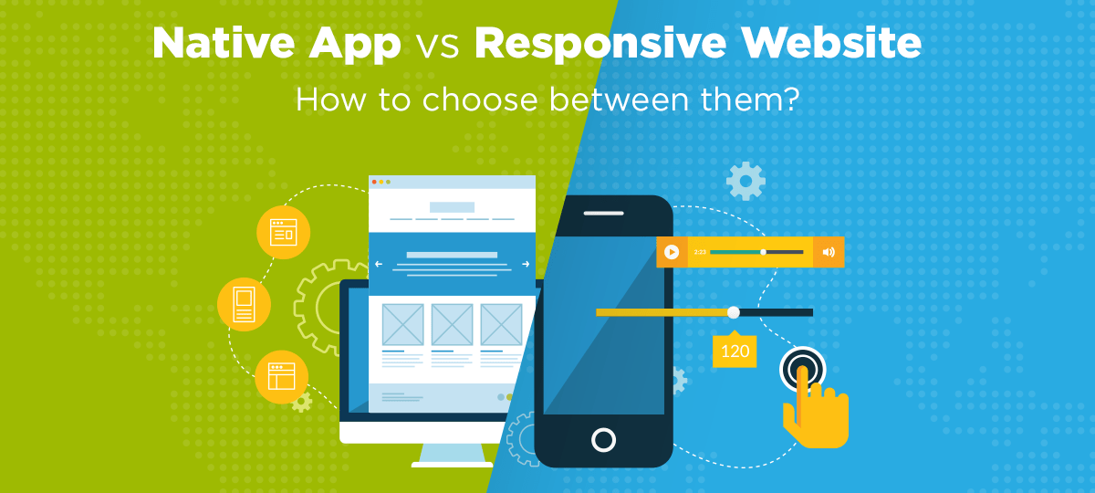
Responsive design is a widely accepted strategy for those looking to maximise their website’s exposure to users across multiple browsers and devices.
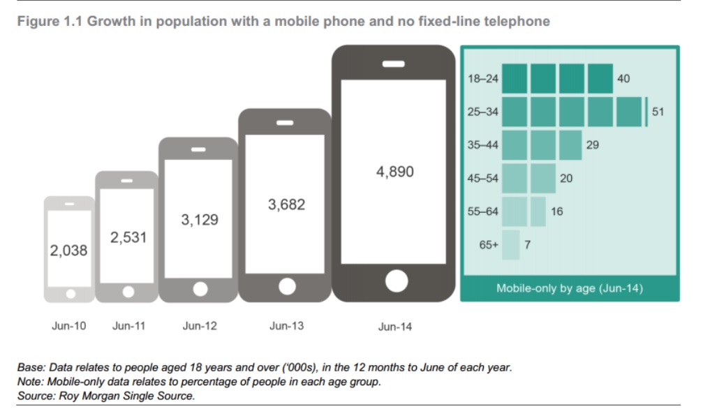
Mobile use is constantly on the rise with Australia’s becoming more likely to ditch the landline and home internet and instead rely solely on mobile devices.
The number of people in Australia with no landline at all to provide phone or the internet has more than doubled in only 4 years.
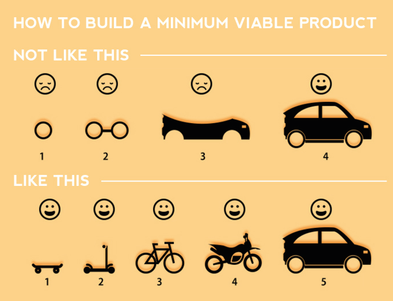
Mobile App’s are quickly becoming the direction where business is going, but we encourage start-up businesses to build scalable app’s, the same way you might start a business.
McDonalds didn’t build 35,000 million stores and then opened up its doors, it started with one… and perfected it.
Uber didn’t have drivers in every country before it went live, it merely started with 3 cars in New York.
Test the Market the market with a Minimal Viable Product first, test the market, learn from it and build on what was successful.
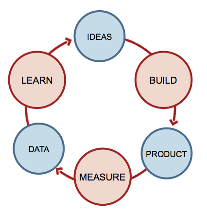
If this mobile-first version of your app works, it shows there is a demand for your business idea and a mobile app would be a better way to move forward.
So… How Does a Mobile First Website Work?
Naturally, when you design for a platform, you want to take advantage of what that platform has to offer and maximise the ‘wow factor’ of the design. However, this can lead to issues when you’ve designed to include functionality which doesn’t scale well between platforms.
If we take top menu navigation as an example, ‘on hover’ drop down menu functionality works brilliantly on desktop machines where the user has access to a mouse, but how does this translate to mobiles, tablets or touch screen PCs where hover effects are not supported?
When approaching responsive design it is small factors like this that have made it a minefield, but what is the solution?
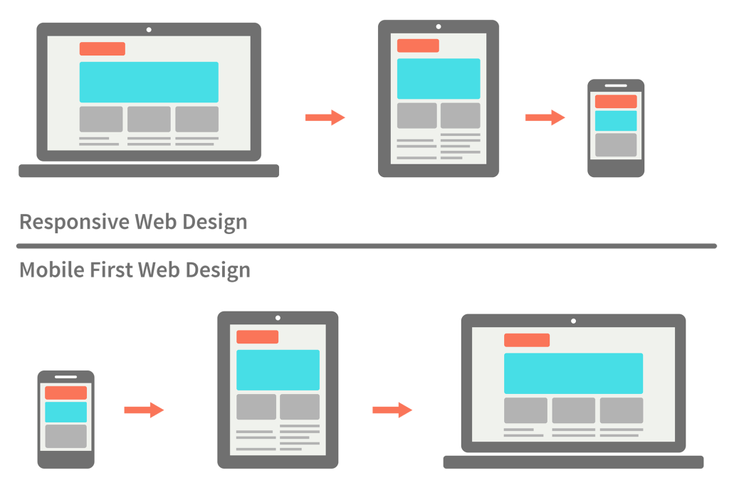
Responsive design is built around the concept of media queries targeting different devices and viewport sizes and this plays into the hands of progressive enhancement as you would design for the smallest size first and enhance your design for the larger devices. This is what the mobile first approach advocates and an increasing majority of the web industry have started adopting this approach. There are also frontend frameworks such as bootstrap have been rewritten to take advantage of this approach.
Are there downsides to the Mobile First Approach?
The first thing to say here is that doing mobile first is neither easy nor is it fun. Responsive design is tricky at the best of times when you’re designing one website for multiple viewports but this does typically allow a designer to explore more options and find the best fit for each device.
When designing from a mobile first approach, you instantly find yourself challenged by constraints and although I’m not a designer I can appreciate that being told/realising that you are limited in what you are able/allowed to do is not a fun place to be in.
For the seasoned designer who is used to designing for desktop first and using this design to scale down, designing mobile first is a large shift in direction and sometimes that change can extend the design process whilst you are still adapting.
Looking objectively at the mobile first approach it is definitely a mixed bag which is very different to how designs were traditionally created. But it serves to highlight and reinforce certain principles which in my opinion has been somewhat lost in the web.
By utilising a mobile first approach, you are forced to examine your website/project with only its bare essentials and prioritise the content. Also, by considering mobile devices first you are able to reduce load times as you load in only the elements required for that device, as opposed to loading in the bloat that is often associated with responsive design. And this can be really important as Google takes page speed into account for their search rankings.
Ultimately the mobile first approach aims to give all your users a consistent experience across multiple platforms and the benefits are there for everyone to see as large companies like Google have also adopted this approach.
How does it help with building an app?
The design of an app ie. what it’s screens look like, it’s buttons look like, animations, etc. greatly impact the cost. This cost will be dramatically reduced by leveraging off a successful mobile-first website to an app because any buttons, designs, etc. would have been designed for the mobile-first website. This fact reduces development time and saves businesses money.
The benefit for your business, however, is the ability to build a platform which you can use on your customer base to determine if your business model is successful before developing an app to ensure it’s success.
If you’d like to share your app idea with one of our team members who understands lean startup models and discuss how a mobile-first website might be a good transition into your app call us today on 1300 781 794
back to the Blog